phase 1
Research and Planning
Collective Thought Media began the core redesign of Towerhill Associates brand ID through a series of meetings with it’s two founders. These meetings and corresponding Q&A’s allowed CTM to gain a clear understanding of Towerhill Associates marketing direction and target audience. Competitive research was completed to determine comparable industry trends, and to ensure unique solutions were implemented with regards to Towerhill’s two most critical needs: stand out logo branding, and a strong online web presence that made use of a Content Management System.
phase 2
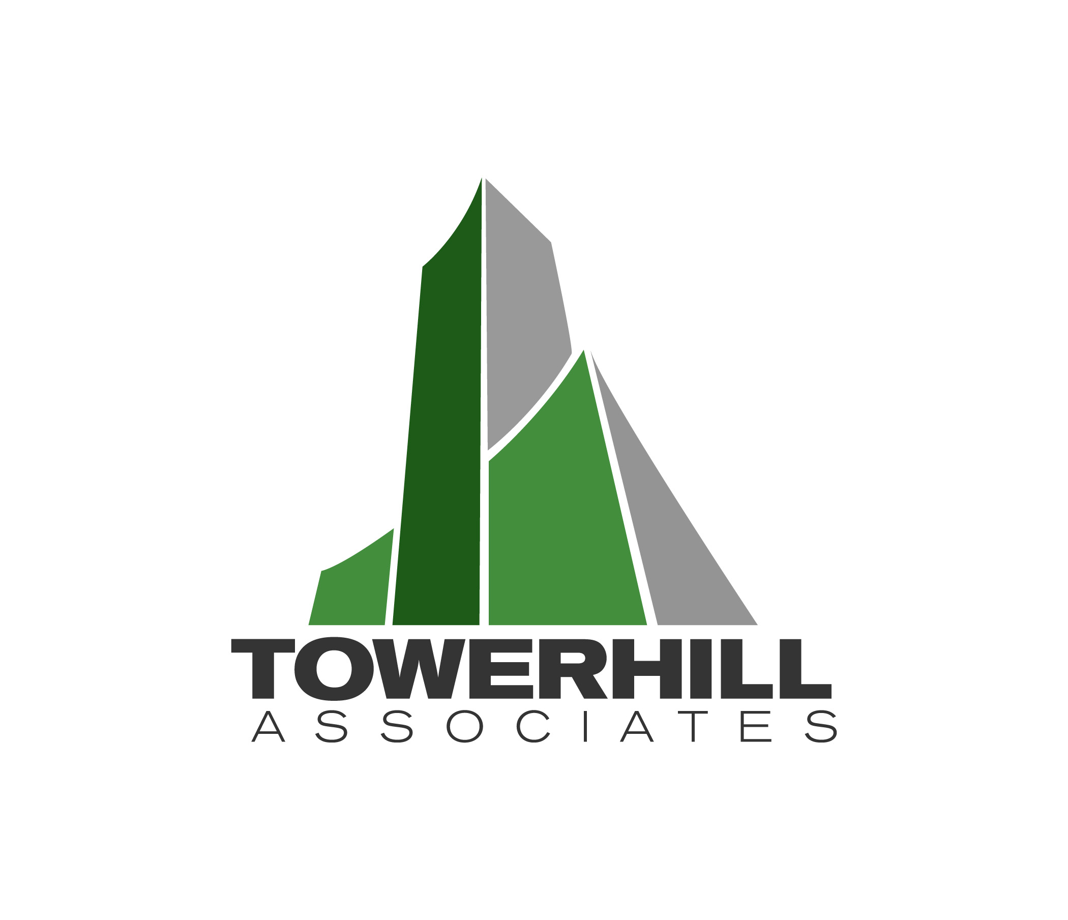
Core Logo Design
Building upon requested client-preferred examples, a detailed Q&A form, as well as through in person conversations, CTM created a series of icon illustrations and custom typography solutions. The desired direction of the logo artwork was modern and clean, with a figurative, simple illustration that would represent Towerhill Associates. There was a strong desire to connect with the “Green” industry, as many of Towerhill’s clients are in the Cleantech sector. Through multiple versions and variations, CTM was able to guide the client through the logo design process, ensuring complete satisfaction and maintaining the quality of the final product delivered.
phase 3.
Supporting Brand Collateral
With a core logo, color palette and typography usage completed, CTM expanded Towerhill Associate’s branding to include business cards, a digital and print letterhead as well as a company PDF overview and general usage guides for logo artwork. Specialty business cards included super thick 16pt matte coated paper, with spot glossy coating on the logo and other elements. Their digital letterhead allowed for the easy creation of properly branded office documents. Their company profile PDF was developed to be a valuable first contact tool with new prospects.